Our DIY 2nd Floor Blue Bathroom Makeover
If you follow me on Twitter(DexieJaneRW) then you’ve read my whining on doing a makeover of our 2nd floor bathroom which is the kids'(and guests) bathroom. As much as I love watching home makeovers and whatnots on HGTV and DIY channels I don’t particularly like being in the middle of it. Finally doing changes in the upstairs bathroom meant we all had to use the downstairs bathroom for 3 weeks. That was NOT fun at all. But that wasn’t the worst part, HAH. It turned out the striped denim textured wallpaper that was so FUGLY the cats have scratched it so much was actually hiding another layer of old wallpaper. The first layer was a breeze to peel off but the 2nd layer was such a pain in the ass. Our house was built in the 70’s but we don’t know how long the 1st layer of wallpaper had been glued into the wall. It was difficult to peel off for sure. Scott ended up buying a steamer from Lowe’s which got the job done.
Aside from the cosmetic makeover, Scott installed an exhaust fan which this bathroom really needed(so does the other one), a new light on the toilet side(the old one used to hit the cabinet doors when opened), as well as hooks, holders, light plugs, and faucet fixtures.
This is the only BEFORE picture I could show you because we really didn’t want to take any pictures of the old look, HAHA. Left was the pain-in-the-ass wallpaper while the right was the ugly striped wallpaper.
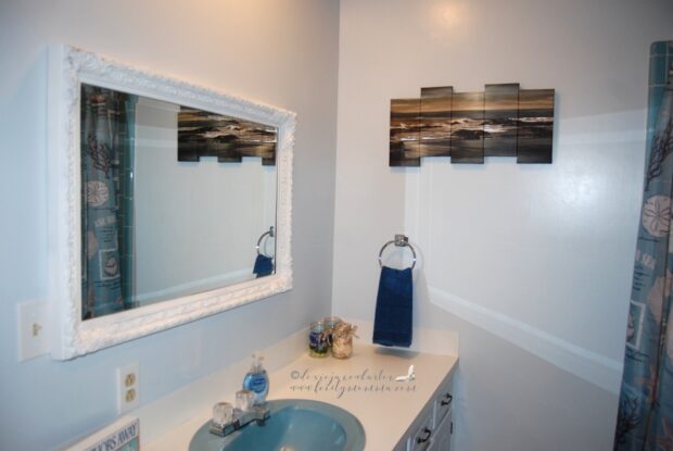
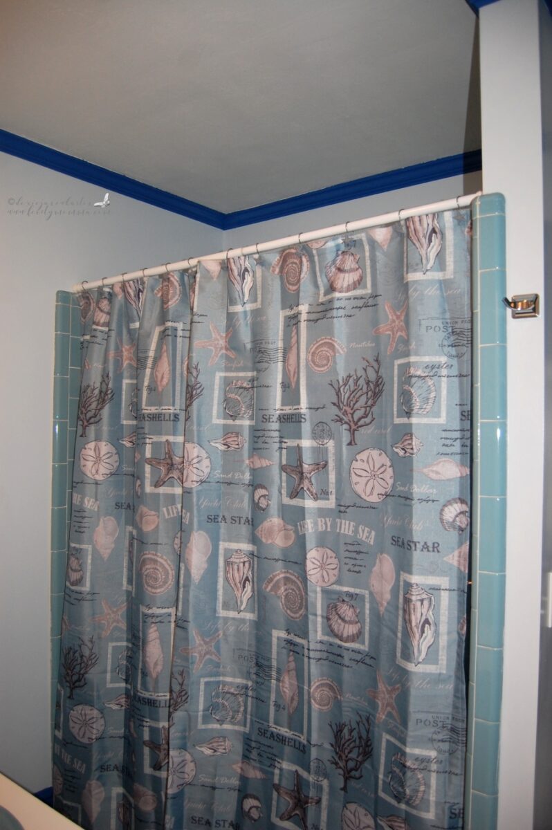
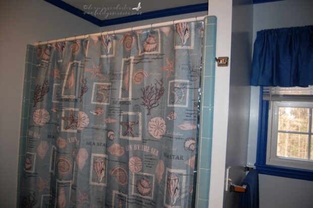
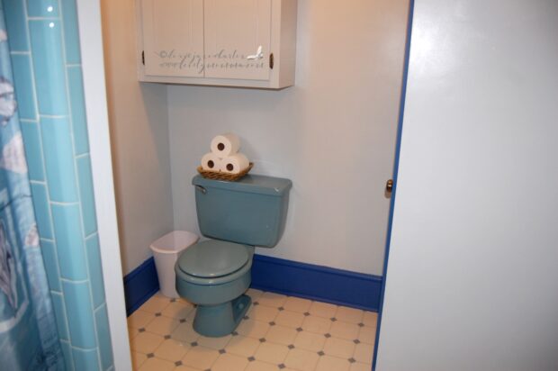
This bathroom has a really nice blue tiles shower/bathtub and toilet bowl. We knew we wanted to paint everything in white but we eventually went for a very light blue and stuck with white for the ceiling. Scott stripped the popcorn ceiling off first before he speckled, sanded, primed, and painted. During the process we decided to paint the cabinets in the same light blue color, and the trimmings and baseboards in blue which really appealed to me since blue is my favorite color and I immediately thought of the beach which Emma and I love.
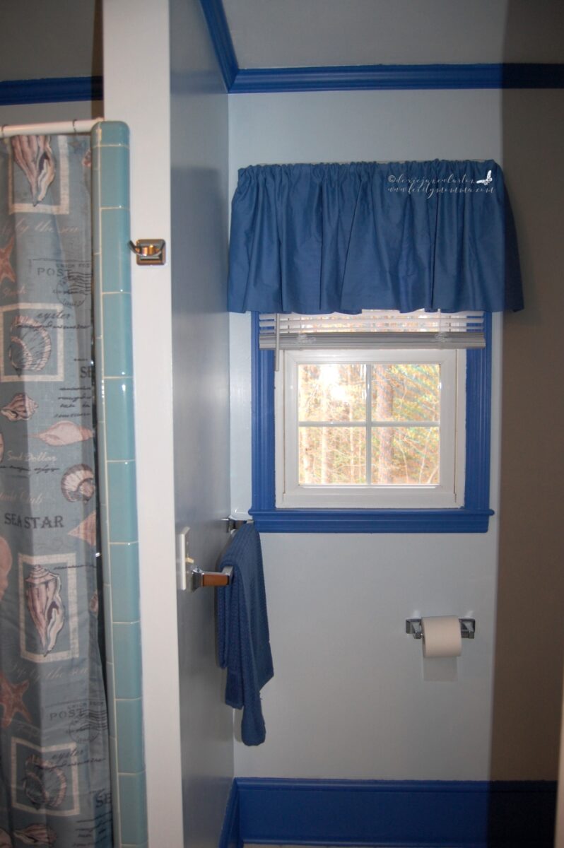
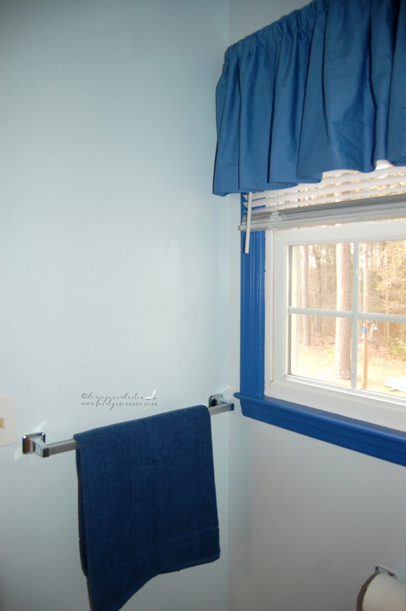
We didn’t mean to but we ended up picking a darker tone of blue for the trimmings. We were hoping it would match the tub and tiles but it was darker than we wanted. Oh well, I wish it is lighter but it’s not that bad. I do like it just the same.
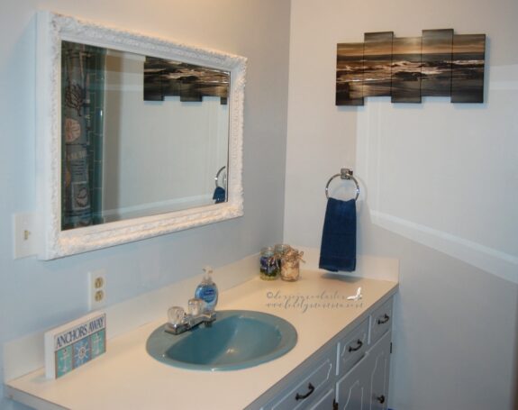
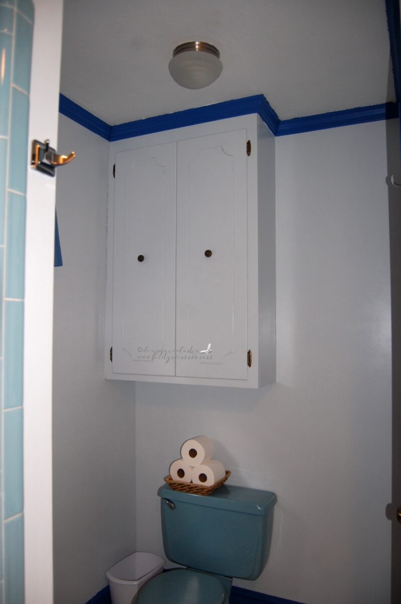
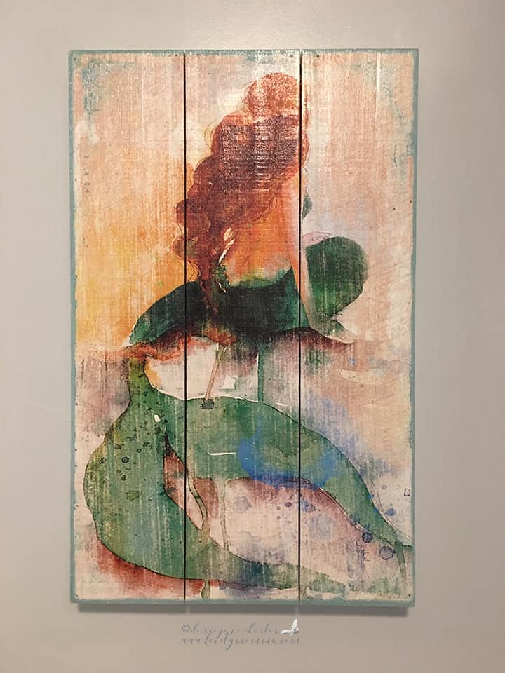
This cabinet used to be brown so we painted it the same color as the wall. Same thing with the sink cabinets. It’s so light blue that you’d actually think it’s white. I plan on mounting a decor on that empty space. I’m going to check Hobby Lobby for a mermaid wall decor sometime soon.
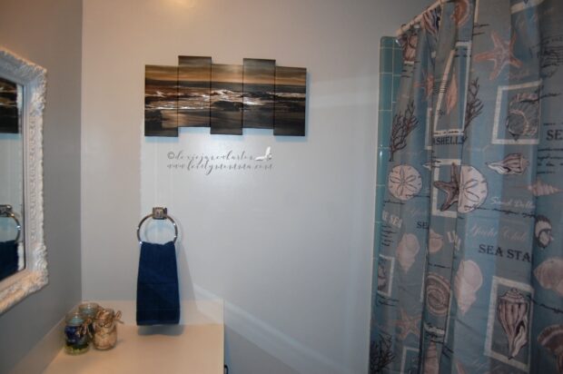
I will eventually put something in this empty wall space above the towel holder as well. I’m thinking an anchor to match the beach/summer/ocean theme. I saw plenty of beach/summer decors at Hobby Lobby so I’d be visiting that place soon.
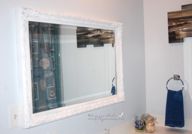
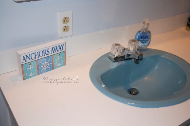
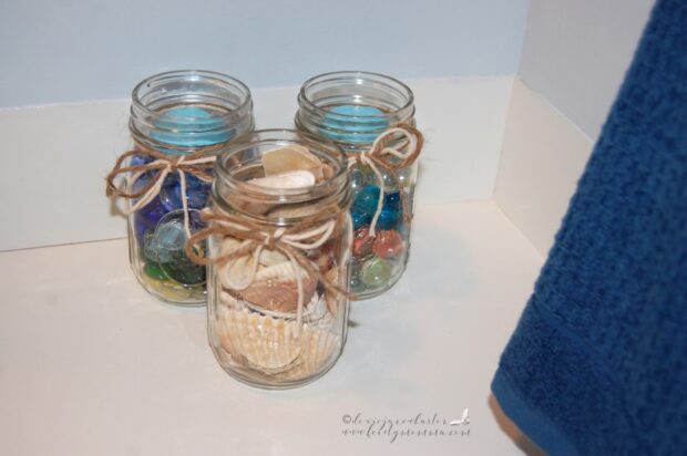
This mirror frame used to have a gold antique-ish look. Scott was going to make it chrome to match the new faucet fixture but when he sprayed it with the primer and showed me how it looked I fell in love with it. I love this white framed mirror now. It’s so shabby chic. I think it’s my favorite detail on this bathroom. We also painted the two big doors the same color as the wall. It’s hard to take the right angle to take pictures of them but a fresh coat of paint always makes things look so much better. Of course I added beach themed decors everywhere to complete the look. There are minor imperfections on the paint job but overall we love it. This is so much better than what it used to look like with the old wallpaper. Despite the dark blue trimmings which isn’t really that bad it’s fresh, bright, and serene bathroom now. AND most importantly, Scott and I did it ourselves. YAY!
[UPDATE: May 2019]


